My avenue is ultimate 1920's glamour
This font is line based and continuous, I love the thick lining and thin lining. It creates a depth that isn't too heavy or disruptive and it gives a class with the delicate line work. The developments using the spots is also amazing. The legibility starts to get more incoherent, but i like the artistic turn it takes and almost becomes a completely different font.
I feel like this type is so classic, elongation of the letter, all at the same height. Thick density and joined by thin lining, creates a classy, elegant feel. Almost amateur looking, it makes the type real and approachable. Very rounded out with the curves and cuts close and tight with the white line to give it a three dimensional look.
Very arty and futuristic. Reminds me of a cult type lettering, used by aliens or signings in satanic ritual books. I love the spacing in the font, the small details and the fact that their not similar or identical to each letter. Makes the font organic and real.
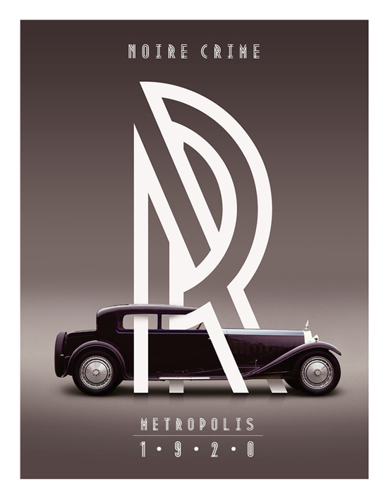
This amazing piece I found of Roll Royce. The line work is amazing, love the angles and the wrapping around the brand. I thought it really stood out and is a great piece of advertisement.
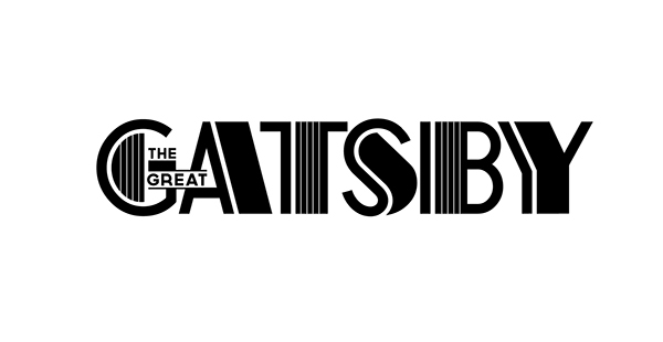
Gorgeous font for the title of The Great Gatsby 2014 film. I've been drawn to a lot of line work and how you can simply build depth and three dimension by implementing line work.


No comments:
Post a Comment