Saturday, 29 November 2014

sixteen by nine moving image brief

We were given a brief which the subject of London as the catalyst, to create a shirt film about anything we creatively could imagine.
We mulled over ideas and nothing seemed to catch our attention or make us passionate. We went on a few a trips around London in the early stages to get some inspiration from the city. We visited Tower Hill, Old Street and Shoreditch. 

An idea from the group was to have ambiguous shots of the landmarks of London. I instantly didn't like the idea but have time for it to be explained and the reasoning behind it. The concept would be to have a different viewpoint of the famous spots of London and see it from a different perspective. Focusing on the textures and noises and close up shots rather than detailed landscape images. 

Another idea from my group were A-Z of London, explaining the sights around London with the first letter of the object. We thought of probable artistic ideas for it and went out to try and get some images of places we could film but nothing really stood out to us or made us passionate. 


In my own time, I looked at some short films for inspiration and came across one called Phaseone - Sugar
 http://www.shortoftheweek.com/2012/04/25/phaseone-sugar/


What I loved about this short was that it was so simply yet engaging. We as humans love to see and hear dialogue, the mystery of what happened before the open dialogue lets the mind run and start to imagine the situation previously. I wanted to use this style and develop a narrative of a person that has to be happy on the outside to please everyone and keep a positive outlook althought they are hurting from something eternal. somewhat a juxtaposition narrative. where wer see the character doing positive things, playing with a child, having fun with friends, doing normally things that should be positive, but taking the messages come up on screen and have them be talking about the true feelings in conversation with someone else. 

Sunday, 23 November 2014

Bold Type Brief: Final Poster - Voguish + Evaluation


I wanted to change up my idea and go for a more artistic approach, using black and white and solely the font that I created. I came up with the word Upper, mainly because the word upper is used for Upper Echelon with is a phrase used to describe those in the wealthier bracket of life. With the sophistication that comes along with wealth and glamour it made me think more about art work in general and ambiguous art.


My Final Poster Design - Vougish


I wanted to make the font into art so created this, simply by having reflections of the letters O,V and J. I love the fluidity and depth, alongside the delicate, intricate definition of the line work. The piece works as a small sizing and large. Even zooming into certain areas makes for beautiful art and ambiguous shapes. 
The font i used was Didot to start as a base for my design. I came to the realisation I couldn't use the copyrighted font so the project is void. I still really like the poster design outcome.

Friday, 21 November 2014

Bold Type Brief: Poster Developement


I loved this play on words for a title for the font, Kutroat. The lines symbolising the sharp, edginess of the type. The flames relating to the satanic symbols of the O and the gritty, realness of the type. 


I wanted to play around with colour and dimension in the flames.
I also experimented with the classic 1920's feel of the type, and wanted to see how I could represent it in a more artistic way. Wanted to have a really classy, simple. elegant approach to showcasing the font in its name.


Wanted to add more context to the design, having black pearls dripping from the top of the poster, giving an alluring and elegant touch.


Wednesday, 19 November 2014

Bold Type Brief: Final Type - Voguish

After changing a few of the lining directions and refining and creating a symmetrical letter for each one, i decided on taking some of the research i'd had and not making each one similar but enough to be paired in a category.  For instance the T and I are balanced with just one negative line through the left side of the text. I wanted the type to be legible and sane, keeping it classy and approachable for most occasions. I love the cultish marking in the O and Q, and the reckless overlapping of the lines on the K. The H is my favourite, mainly because its a guessing game of which of many lines is the original.
The Y is a sentiment to the cocktail glasses of the 1920's and the glamour of drinking champagne.
The one letter that is unique from the bunch is the U. I created the mid lining because I didn't want to weight it down too much, also its in line with the lines on the letter V. The letter i struggled with most is the Z, i think it's originally not a very nice and it was hard not to make it look too weighty with the lines.


Tuesday, 11 November 2014

Bold Type: Development Stages

Using Font Suite, I created a font using the edit suite which lets you manipulate a chosen font. These are a few things I was experimenting with to get used to the program and understand how it works.


This is the final design that i decided on working with Font Suite.
I then got onto Illustrator and started to refine my font more to my taste.

I wanted to create the line work i'd previously looked at and out my own spin on it but not having it weigh down the type but have it fill in any gaps or negative spaces.


Experimenting with my handwriting on Illustrator and using different mark making to give it more stylistic value.

Wednesday, 5 November 2014

Bold Type Brief: Research

My avenue is ultimate 1920's glamour


This font is line based and continuous, I love the thick lining and thin lining. It creates a depth that isn't too heavy or disruptive and it gives a class with the delicate line work. The developments using the spots is also amazing. The legibility starts to get more incoherent, but i like the artistic turn it takes and almost becomes a completely different font.


I feel like this type is so classic, elongation of the letter, all at the same height. Thick density and joined by thin lining, creates a classy, elegant feel. Almost amateur looking, it makes the type real and approachable. Very rounded out with the curves and cuts close and tight with the white line to give it a three dimensional look.


Very arty and futuristic. Reminds me of a cult type lettering, used by aliens or signings in satanic ritual books. I love the spacing in the font, the small details and the fact that their not similar or identical to each letter. Makes the font organic and real.
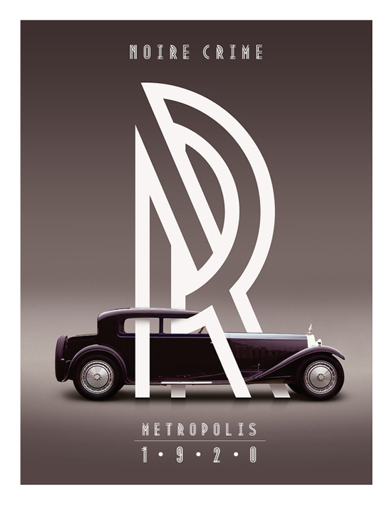
This amazing piece I found of Roll Royce. The line work is amazing, love the angles and the wrapping around the brand. I thought it really stood out and is a great piece of advertisement.
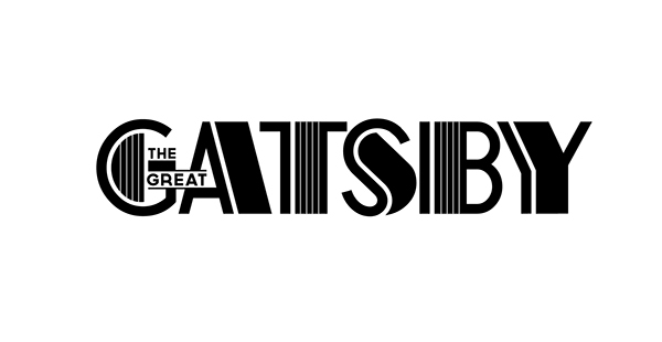
Gorgeous font for the title of The Great Gatsby 2014 film. I've been drawn to a lot of line work and how you can simply build depth and three dimension by implementing line work.