Tuesday, 24 March 2015
Monday, 9 March 2015
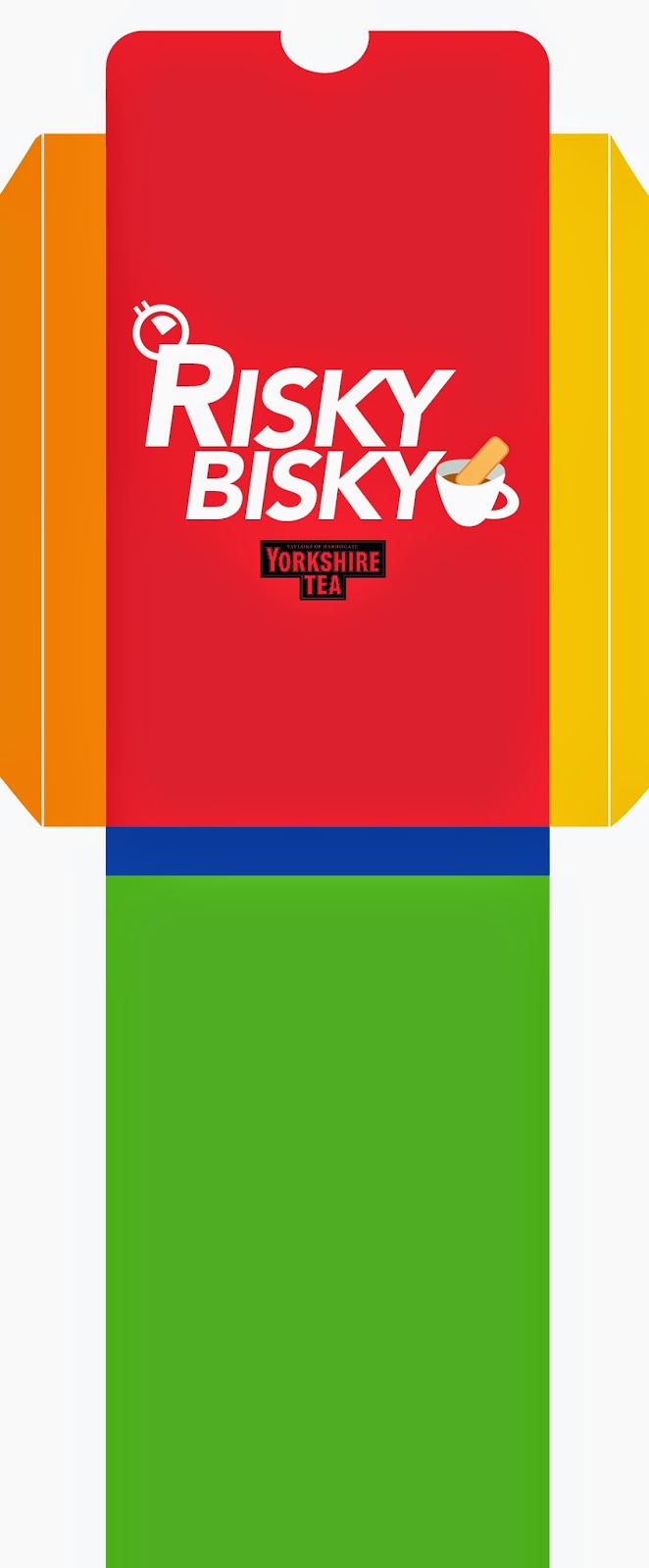
YCN; Yorkshire Tea; Risky Bisky Final Packaging Template
For the packaging, I first wanted the box of cards to go into the existing Yorkshire Tea packaging, and when purchased they would get the game.
Here was the layout for that design. It was slim, and easy to store without taking up too much space.
So I decided to create a separate product that could be found alongside the tea section which has samples of the Yorkshire Tea inside it. The packaging would be bigger and wider allowing space for the tea bags to have their slot. I think it's a better idea because it will introduce new people to the tea and they will feel obliged to buy the tea again if they enjoyed the game.
I added the information "Love Yorkshire Tea? Have a look at our range at www.yorkshiretea.co.uk and have a proper brew! Also available in stores" so people have the information for future purchases.
Also to make people more brand aware I put the Logo on the front of the box as well.
Thursday, 5 March 2015
YCN; Yorkshire Tea; Risky Bisky design devlopment
Artists Research
I was told in the feedback that i needed to do more research on styles and layouts that will inspire me to be more design savvy. I cam across the agency Hype and Slippers who created Trio, which was renowned for the amazing design and style. I want to create a simplistic style that makes people want to look at the product and engage them.
The feedback I got for my previous designs was to try and be more contemporary and use better design to communicate the game. I need to consider the font type and point size when dealing with A5 sized cards.
I changed the style of the illustration to something more simple and clean. It allows for the page to feel less cluttered and better design layout.
The last set of cards is my favourite design layout from all the tests above. I opted for colours again because I want to make the illustrations contrast so they are more prominent. I have taken inspiration from the design of a deck of cards, the simple information in the top left and bottom right of the cards.
These are my experiments with layout, type and scale. I decided that I wanted to keep the front cover of Risky Bisky only with the logo and not the yorkshire tea logo. I opted to put the stopwatch graphic and cup of tea with biscuit in it to show the premise of the game. I want it to be fun and engaging. I decided on the font Avenir for the inside cover with the biscuits and Avenir Black for the font for the logo.
Tuesday, 3 March 2015
YCN; Yorkshire Tea Game: Risky Bisky Game
Experimenting with the title of the game.
Game concept;
Light hearted slogans that link back to the crumble catchers advantages.
The game is an incentive for people to see the use of the crumble catcher product that is on offer. The time range given for each specific biscuit is a range from low to high risk, only risk takers will take the advice. i want people to push the boundaries and in turn have the biscuit crumble so that the product then becomes a necessity and is viable.
Monday, 2 March 2015
YCN; Yorkshire Tea: game development ideas; game style
Ideas;
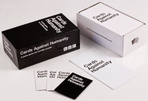
Top Trump style game
Top Trumps is a card game published in 1968. Each card contains a list of numerical data, and the aim of the game is to compare these values to try to trump and win an opponent's card. A wide variety of different packs of Top Trumps has been published.
For my game I will have the dunkability, soakabilty, crumbalility, crunchability as key points in the trump style information.
I'm figuring out what type of information I would include alongside the facts for extra information and content.
I have printed 'A Nice biscuit is a coconut-flavoured biscuit. It is thin, rectangular in shape, with rounded bumps on the edges, and lightly covered with a scattering of large sugar crystals, often with the word "NICE" imprinted on top in sans-serif capital letters' information taken from wikipedia.com.
I was thinking maybe a more colloquial funny statement about Nice biscuits could be more engaging or entertaining.
quote used as example from
The aim from this dunking game would be the person could have a better understanding and judgement on the biscuit their about to dunk.
Numbered Cards/Order of cards
I developed a numerical order for the cards to go in, with the visual of the numbers the same as the biscuit. This idea is for people to know what biscuit you dunk first and what order they come in.
Front and Back views of the cards.
I haven't decided on what the content will be in the clear boxes yet.
Subscribe to:
Comments (Atom)


