Monday, 8 December 2014

sixteen by nine moving image Final + Evaluation

The day before the initial hand-in we didn't have a concept or any footage to create a Short.
It was a really stressful time, and we were all very low on enthusiasm at that point. I made a decision to get out and film and whatever we could salvage or get inspired by whilst were out from the footage we could use.

We split into two groups and Ben and I went ahead and explored Brick Lane, whilst Lily and Alex went around Shoreditch. Thinking that if we split and had more ground a to cover there's a likely chance we'd get inspired and come up with something. 


As Ben and I wondered through Brick Lane we noticed that there a lot of niche and artistic coffee shops, cake shop, bagel places and curry houses. The famous strip inspired us to film the foods in the shop windows and people ordering eating and throwing away their food. After filming a few places and asking nicely to film people taking bites out of their lunch, we came across a clip of a woman cutting salt beef in the window which we thought was so beautiful. The movement of the beef, the skill of her experience and rapidness of cutting bagging and giving to the customer was so interesting. We reviewed the footage and immediately wanted to go down that route. We met with the other half to discuss and trade equipment, we explained that we'd come across and said we're going to carry on filming our foods around he east but for a concept were going to try and film something inside the bagel shop to go around the cutting of that salt beef. 


 A shot I got of some people eating their bagels outside the location.


So we went back to the shop and asked if we could film Ben ordering, purchasing and eating the salt beef bagel and we were given permission to film whatever we wanted and free to do so which was amazing. As Ben was eating the bagel I got close shots of the process, using soft focus and detailed close up to get depth. Also surrounding shots of others eating the bagels and gorging on the fatty meat. The meat filmed so beautifully, the oozing fats and oils and the messiness makes it an experience. I wanted to get little moment likes wiping on the hands and mouth, also at the end throwing the paper bag away to make it real and raw also relatable.


The concept of the short is the demise of the bagel, the beginning to end, how things don't last and it's a never ending cycle. We added classical music for a juxtaposition effect and we think it works really well with building tension and emotion to the film.

link to first draft of short film: vimeo.com/113927709 

password is beef

The second edit of the short film: https://vimeo.com/118830383
We went out and filmed more footage and created a narrative of the journey. 

I'm extremely happy with the outcome of our film, I think me and Ben worked great as a duo and were in sync the whole time. The film could be better, I think there's room for narrative or interaction with portraiture of locals at the bagel shop. if we had more time than a day I would of loved to ask questions and get information about the place the road (brick lane) and look out for locals and their behaviours. We would of still kept it as a main visual of the bagel shop. I've always loved film and I think this project ignited it again. I'm excited to inplement it into future projects and hopefully work close with alex from photography who I've become good friends with. 


Saturday, 29 November 2014

sixteen by nine moving image brief

We were given a brief which the subject of London as the catalyst, to create a shirt film about anything we creatively could imagine.
We mulled over ideas and nothing seemed to catch our attention or make us passionate. We went on a few a trips around London in the early stages to get some inspiration from the city. We visited Tower Hill, Old Street and Shoreditch. 

An idea from the group was to have ambiguous shots of the landmarks of London. I instantly didn't like the idea but have time for it to be explained and the reasoning behind it. The concept would be to have a different viewpoint of the famous spots of London and see it from a different perspective. Focusing on the textures and noises and close up shots rather than detailed landscape images. 

Another idea from my group were A-Z of London, explaining the sights around London with the first letter of the object. We thought of probable artistic ideas for it and went out to try and get some images of places we could film but nothing really stood out to us or made us passionate. 


In my own time, I looked at some short films for inspiration and came across one called Phaseone - Sugar
 http://www.shortoftheweek.com/2012/04/25/phaseone-sugar/


What I loved about this short was that it was so simply yet engaging. We as humans love to see and hear dialogue, the mystery of what happened before the open dialogue lets the mind run and start to imagine the situation previously. I wanted to use this style and develop a narrative of a person that has to be happy on the outside to please everyone and keep a positive outlook althought they are hurting from something eternal. somewhat a juxtaposition narrative. where wer see the character doing positive things, playing with a child, having fun with friends, doing normally things that should be positive, but taking the messages come up on screen and have them be talking about the true feelings in conversation with someone else. 

Sunday, 23 November 2014

Bold Type Brief: Final Poster - Voguish + Evaluation


I wanted to change up my idea and go for a more artistic approach, using black and white and solely the font that I created. I came up with the word Upper, mainly because the word upper is used for Upper Echelon with is a phrase used to describe those in the wealthier bracket of life. With the sophistication that comes along with wealth and glamour it made me think more about art work in general and ambiguous art.


My Final Poster Design - Vougish


I wanted to make the font into art so created this, simply by having reflections of the letters O,V and J. I love the fluidity and depth, alongside the delicate, intricate definition of the line work. The piece works as a small sizing and large. Even zooming into certain areas makes for beautiful art and ambiguous shapes. 
The font i used was Didot to start as a base for my design. I came to the realisation I couldn't use the copyrighted font so the project is void. I still really like the poster design outcome.

Friday, 21 November 2014

Bold Type Brief: Poster Developement


I loved this play on words for a title for the font, Kutroat. The lines symbolising the sharp, edginess of the type. The flames relating to the satanic symbols of the O and the gritty, realness of the type. 


I wanted to play around with colour and dimension in the flames.
I also experimented with the classic 1920's feel of the type, and wanted to see how I could represent it in a more artistic way. Wanted to have a really classy, simple. elegant approach to showcasing the font in its name.


Wanted to add more context to the design, having black pearls dripping from the top of the poster, giving an alluring and elegant touch.


Wednesday, 19 November 2014

Bold Type Brief: Final Type - Voguish

After changing a few of the lining directions and refining and creating a symmetrical letter for each one, i decided on taking some of the research i'd had and not making each one similar but enough to be paired in a category.  For instance the T and I are balanced with just one negative line through the left side of the text. I wanted the type to be legible and sane, keeping it classy and approachable for most occasions. I love the cultish marking in the O and Q, and the reckless overlapping of the lines on the K. The H is my favourite, mainly because its a guessing game of which of many lines is the original.
The Y is a sentiment to the cocktail glasses of the 1920's and the glamour of drinking champagne.
The one letter that is unique from the bunch is the U. I created the mid lining because I didn't want to weight it down too much, also its in line with the lines on the letter V. The letter i struggled with most is the Z, i think it's originally not a very nice and it was hard not to make it look too weighty with the lines.


Tuesday, 11 November 2014

Bold Type: Development Stages

Using Font Suite, I created a font using the edit suite which lets you manipulate a chosen font. These are a few things I was experimenting with to get used to the program and understand how it works.


This is the final design that i decided on working with Font Suite.
I then got onto Illustrator and started to refine my font more to my taste.

I wanted to create the line work i'd previously looked at and out my own spin on it but not having it weigh down the type but have it fill in any gaps or negative spaces.


Experimenting with my handwriting on Illustrator and using different mark making to give it more stylistic value.

Wednesday, 5 November 2014

Bold Type Brief: Research

My avenue is ultimate 1920's glamour


This font is line based and continuous, I love the thick lining and thin lining. It creates a depth that isn't too heavy or disruptive and it gives a class with the delicate line work. The developments using the spots is also amazing. The legibility starts to get more incoherent, but i like the artistic turn it takes and almost becomes a completely different font.


I feel like this type is so classic, elongation of the letter, all at the same height. Thick density and joined by thin lining, creates a classy, elegant feel. Almost amateur looking, it makes the type real and approachable. Very rounded out with the curves and cuts close and tight with the white line to give it a three dimensional look.


Very arty and futuristic. Reminds me of a cult type lettering, used by aliens or signings in satanic ritual books. I love the spacing in the font, the small details and the fact that their not similar or identical to each letter. Makes the font organic and real.
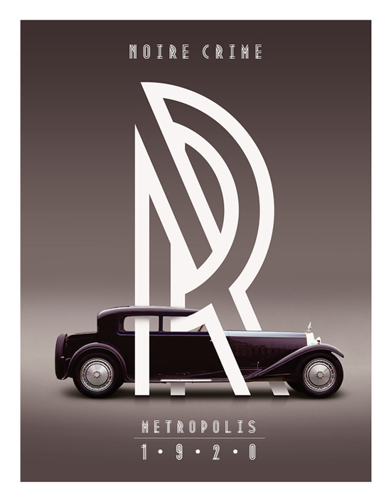
This amazing piece I found of Roll Royce. The line work is amazing, love the angles and the wrapping around the brand. I thought it really stood out and is a great piece of advertisement.
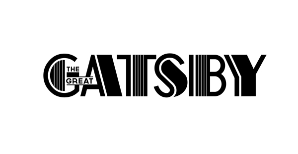
Gorgeous font for the title of The Great Gatsby 2014 film. I've been drawn to a lot of line work and how you can simply build depth and three dimension by implementing line work. 

Wednesday, 29 October 2014

SomeOne Live Breif: Finale


For the outcome of the Someone Brief I have learned that innovative ideas are key to impress people that work in industry. Although my idea has all the basis to work and be successful, it can be done and has been done by companies before. I really enjoyed this project as we got to research the charity and rebrand their public perception. I chose to make it fun and interactive so people will have a reason to keep coming back. I appreciated the feedback given by the client at Someone and will introduce it to my future projects.

Tuesday, 28 October 2014

SomeOne Live Brief: Santa's Little Helper: Progression for The Children's Society


SomeOne Live Brief: Santa's Little Helper

David Barnet, helped us come to a decision of what is a feasible idea for charity to do for campaign, spending as little as possible to raise a lot. I went away and thought of trending topics in todays market that affects youths and adults. As the new release of the new iPhone 6 and 6+, the IOS8 update and impeding new iPad launch, I recognised a demographic that spans across all ages, apps. 

I researched app companies such as Game Loft, recorded to have made $321 million in 2014 to see the substantial market and platform that they have. From this information I went about the idea of setting up a Add-On type game that was primarily associated with the charity and most of the proceeds go to the charity.
The hard work would be getting a gaming developer that would let us take on there game and have association with them. 

I did a presentation to my tutors and peers and presented the idea of a simple level based game that would reward you as you get to each level. At the end of the game, having been given small snippets of information about the charity each level, they have the chance to donate via the app. 
I also had the idea of having the app be purchased by the gamer, but it was suggested that it just be an automatic update instead.

I went for the theme of Christmas, mostly because it is approaching and it's proven that people are more like to feel family oriented, and more willing to be generous around that holiday season. I called my campaign 'Presents for Vulnerable Children at Christmas' but the game will be called "Santa's Little Helper". 

i went away and did research on what game i could use as a platform for my demonstration for the idea. I found that Angry Birds was a popular choice, but it would be too hard to connect between their current theme and The Children's Society. I racked my brain, searched top charting apps, and found a game called 'Doodle Jump'.


The layout is very simple and easy to imprint a theme onto. I loved the character because it's all alone completing this never ending mission by itself. It's extremely sweet and is childlike. The game is level based and comes with a lot of skins, which are themed (halloween, easter, space aliens etc). 
So i mocked up a few Christmas theme ideas, and ended up with the idea of the point of the game is to collect as many presents for the children. 

I wanted to add the feature that you could find out more about the charity and the 'game over' phase too. For the donations part, I added a coin system which the user could select how much to donate.


Upon feedback, i was told the page was too busy and people were most like not willing to read that. So, i'll be changing that with less information and leave that to the information between levels.


Monday, 20 October 2014

SomeOne Live Brief for The Childrens Society


We visited SomeOne agency and they set us a live brief to either Re-Brand, create an Ad Campaign or create a Viral Campaign for a UK based charity, The Children's Society.

I went away and did extensive research on the company, trying to find out there mission and what their message is. They work to stop children feeling abandoned, excluded or isolated. Also, directly improve lives of children by on going schemes. Promote forward thinking and government legislation to be improved and create new laws. Their motto is "All Children Deserve a Childhood".

They work with a range of cases from abuse (mental and physical), refugees, disabled children, youth carers, runaways and vulnerable youth in the UK. The charity clearly shows on their website a timeline of the things they have achieved and that they have been doing so for over 100 years. 

I looked into some of their past campaigns to get a feel for the style they usually like to work in, or maybe to see if they haven't try something that is successful nowadays. 

  • Out Cry! - Bali for Immigration: Campaign for Immigration detention of kids.
  • Hundreds of Thousands of Childhood Memories: collecting childhood memories and putting them on a social platform form for others to enjoy (mostly for company exposure)
  • Safe and Sound: Support the vulnerable youth that are in any type of danger, on the street, criminal activity or at home.
  • Games Up: to help prevent and help those in prostitution.


The charity have increased their fundraising by 6% between 2009-2010 to £42.4m, which was implemented whilst the new design was configured. I researched where the money that was raised in 2013 came from and the highest amount at £25.4m was from donations, legacies and grants. 

Knowing this, I wanted to focus directly on charitable donations from people.